
How to Choose the Perfect Home Colour Palette | With Farrow & Ball Inspiration
Expert tips, step-by-step guides, and colour rules to help you create a cohesive home décor scheme.
Discover how to choose the perfect home colour palette with expert tips, the 60/30/20 rule, and Farrow & Ball inspiration for cohesive interiors.
Picking out the perfect colour palette for your home is one of those steps in decorating that really changes everything. The right colours can make your space feel cosy, uplifting, chic, or whatever vibe you’re after. At first, choosing the best palette might seem a little overwhelming with all the options out there. I’ve been there a few times, loading up walls with paint samples and still not feeling completely certain. But with a few tricks and a clear understanding of design rules, it gets a lot easier, and honestly, pretty fun.
Hello & welcome, my passion for interior styling began when we moved into our Georgian home and I set out to transform its plain walls into colourful, character-filled spaces. Over the years I’ve fallen in love with bold paint choices, thoughtful lighting, and accessories that highlight a home’s natural charm. Now I share simple, inspiring décor ideas to help others create rooms that feel warm, personal, and beautifully unique.
Garden Nest Living grew from a simple idea: to share my love of gardens and creating calm, beautiful spaces, both inside and out. When you buy through my affiliate links, you are allowing me to keep sharing inspiration, ideas and products… at no extra cost to you. Thank you for being a part of my journey!
Why Your Home Colour Palette Matters
Emotional and Practical Impact of Colour
I’ve found that colour isn’t just about looks; it’s about how the space feels and how you enjoy your home. Different colours can totally switch up your mood and the energy of a room. Soft blues and greens (my two favourites) can add a calming touch, while bolder hues like deep reds or navy (another favourite of mine) bring drama and cosiness. The power of a good palette is that it ties everything together, making even simple decor feel intentional and put together.
How the Right Palette Ties your Home Together
Colour can visually shape a space, too. Light tones make rooms look bigger and airier, which is super useful if you’re working with smaller areas. Darker shades work well for grounding a large, open room and making it feel more snug. Choosing a consistent palette brings your home together, no matter how many different styles or pieces you love. Plus, a thoughtfully chosen colour scheme can highlight architectural details, allowing features like crown moulding or built-in shelving to truly shine.
Get Inspired – Where to Start With Colour Ideas
Before you get into paint samples, it helps to step back and view your home as a whole. Here’s how I usually begin:
Mood boards, Pinterest, and Real-Life Inspiration
- Get Inspired: Flip through magazines, scroll Pinterest, or take a walk through your favourite places. Save pictures and put together a mood board of colours you’re drawn to.
Using Farrow & Ball Paint Collections as a Starting Point
- Identify the Vibe You Want: Farrow & Ball paint collections are a great starting point because their curated palettes make it easier to find shades that work beautifully together. Identify the vibe you want: ask yourself how you want each room to feel—relaxed, energising, or bright and airy—as this quickly narrows down your options. From calming neutrals to bold, dramatic tones, Farrow & Ball offers colours that help you match mood with style effortlessly.
When it comes time to choose, I like starting with a hero colour; this is one main colour you know you love and want to build the rest of your scheme around. Then you can layer in supporting hues and a few contrasting shades to give the whole look more depth. This method keeps everything from feeling flat and also makes decorating easier as you add new items over time.
Understanding Colour Basics for Interior Design
Knowing a few colour wheel fundamentals can really make choosing colours easier. Here’s a quick breakdown:
Analogous, Complementary, and Monochromatic Schemes
- Analogous Colours: These are found next to each other on the colour wheel, like blue and green. They naturally look harmonious and make rooms feel super soothing.
- Complementary Colours: These sit across from each other on the wheel, such as blue and orange. Pairing them together makes things pop, but too much can be overwhelming.
- Monochromatic Colours: Different shades of the same colour. This approach reads as sophisticated and is easy to pull off… even with just one primary colour.
If you want a balanced, timeless look, stick to two or three main colour families. Mixing in black, white, or natural textures (like wood and stone) adds layers and keeps things interesting, even in a more basic scheme.
How Undertones and Finishes Affect the Final Look
Undertones can completely change how a colour feels in a space—what looks like a simple grey might actually lean warm with beige undertones or cool with hints of blue. Finishes make just as much impact: matte creates a soft, velvety look, while satin or gloss reflects light, adding depth and highlighting architectural details. Choosing the right undertone and finish ensures your colour scheme feels intentional and balanced.
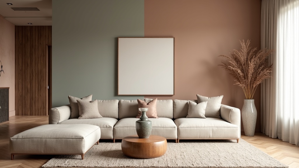
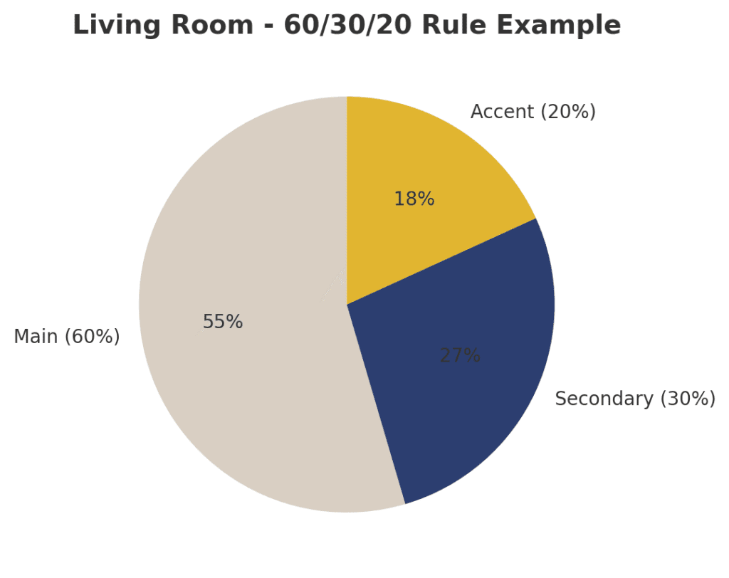
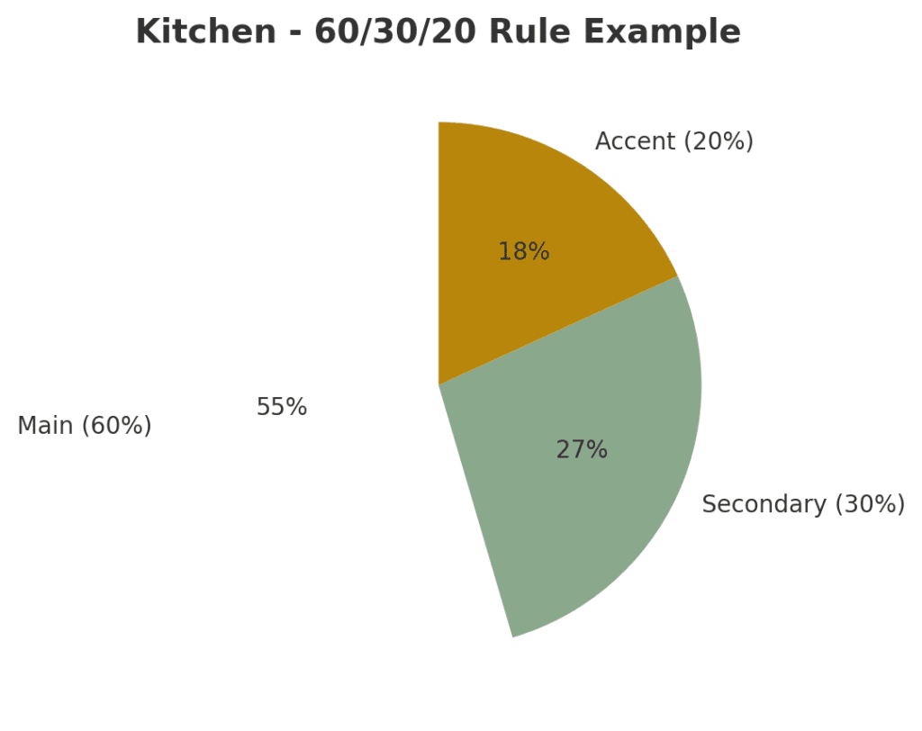
The 60/30/20 Rule for Decorating Success
What the Rule Means
This simple rule of thumb keeps things in balance, and I have used it for both quick room refreshes and bigger decorating projects. The 60/30/20 rule works like this:
- 60%: The main colour, which usually appears on walls, large rugs, or big furniture pieces.
- 30%: The secondary colour, which supports your main colour and offers contrast. Think accent chairs, curtains, or bedding.
- 20%: The accent colour, which adds personality through pillows, art, vases, or even a punchy side table.
This structure stops a room from feeling too plain or too hectic. If you want things even more streamlined, use the three-colour rule for a crisp look: pick a main shade, one supporting, and one accent colour per space. This is a trick used in interior design that makes colour coordination a breeze.
Practical Examples for Living Rooms, Kitchens & Bedrooms
Here I have three practical examples of how to apply the 60/30/20 decorating rule in different rooms:
Living Room: Use a warm neutral like soft beige for 60% (walls and large sofa), a deep navy for 30% (curtains and an accent chair), and mustard yellow for 20% (cushions, throws, and artwork).
Kitchen: Go with crisp white for 60% (cabinets and walls), sage green for 30% (backsplash tiles and bar stools), and brass accents for 20% (handles, lighting, and small accessories).
Bedroom: Choose a calming grey for 60% (walls and bedding), blush pink for 30% (curtains and a rug), and charcoal for 20% (lampshades, cushions, or a statement headboard).
How to Pick the Right Colours for Your Home
I get asked a lot: “How do I even know what colours are right for me?” There’s no magic answer, but these tips help:
Firstly, if you’re unsure, peek inside your wardrobe. You probably enjoy being around those colours and will feel at ease living with them too.
If you’re really stuck, try gathering up fabric swatches, tiles, or colourful objects you love and see which combinations naturally feel right together.
Considering Natural and Artificial Light
- The direction of your rooms and which light they get can totally change how colours appear. A colour might feel soft and pretty in one room, or look a bit drab somewhere else.
- Windows and bulbs drastically alter how colours appear. Daylight can feel cool or even blue, while lightbulbs bring a different warmth that shifts the colour’s mood.
Matching Paint with Flooring, Furniture, and Existing Features
- Take Note of Existing Elements: Don’t ignore things you’re keeping, like floors, tiles and furniture. The right palette needs to work with these pieces, not against them.
- Challenging Flooring: Wood or tile floors with strong undertones (like orange or pink) can clash with certain wall colours. Match your paint’s undertones to your existing surfaces for harmony.
Testing Samples Throughout The Day
- Always put paint samples on the wall and look at them during different times of the day. Digital palettes are helpful, but real-life samples are best for noticing undertones.
Creating Flow Between Rooms
Why Consistency Matters in Open-Plan Homes
- Especially for open-plan homes, it’s helpful if colours blend well as you walk from room to room. This approach avoids a jarring effect.
- Homes can feel disjointed if every room has unrelated colours. Even repeating small accents around your house will help link the whole look together.
Farrow & Ball Paint Inspiration: Creating Flow Between Rooms
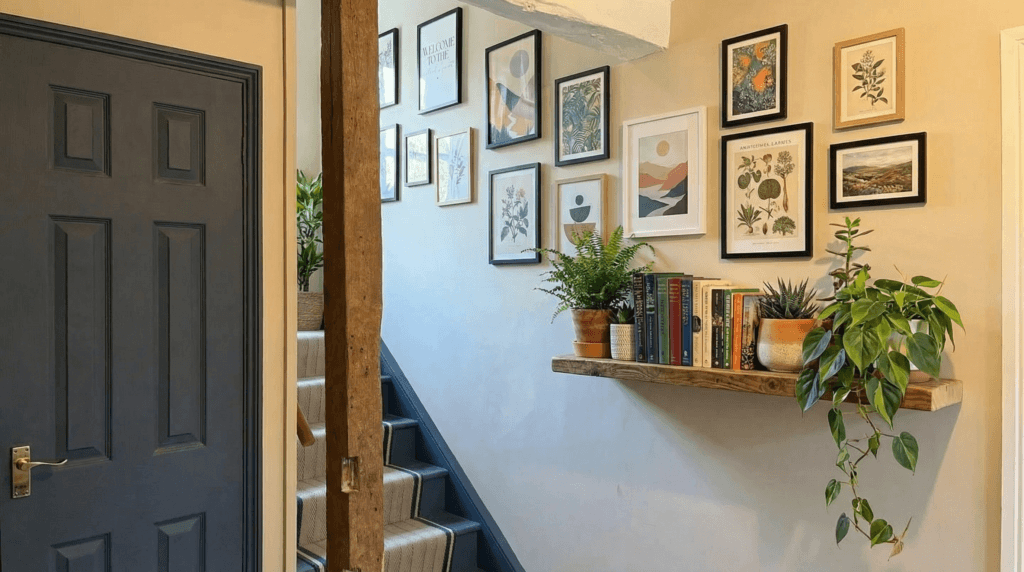
I’ve lost count of how many times I’ve changed my mind when decorating a room – and honestly, that’s part of the fun! Just a few months ago, I repainted our stairs and utility room. I originally went with a soft blue from Farrow & Ball, hoping the lighter shade would make the smaller space feel more open. At first, I was pleased with it, but after living with it for a couple of weeks, I realised the colour just didn’t feel right.
So, I picked up the paintbrush again and this time chose a deeper, richer shade – ‘Olive’ by Farrow & Ball. I absolutely love how it turned out! It not only feels more inviting but also flows beautifully with the ‘Chalke Green’ in the adjoining room.
The truth is, there’s nothing wrong with changing your mind when it comes to decorating. Every adjustment helps create a home that truly reflects your personality – and that’s what gives it a unique, lived-in charm.
Decorating with Confidence (Even If You Change Your Mind)
What if I Change My Mind?
I’ve changed my mind plenty of times! If you want to change things up, it’s easy to swap out accents or repaint a single wall, but switching your main colour is harder. That’s why starting with flexible, classic shades is a smart move if you get the urge to mix things up often.
Flexible Foundations and Neutral Bases
- Start with Neutrals (If Unsure): It’s totally fine to use neutral tones as your palette’s base. Add in colour through art, pillows, or an accent wall if you want something bolder but aren’t ready for a huge commitment.
Easy Ways to Swap Accents Seasonally
- Don’t Forget About Flexibility: If you get bored quickly or your taste changes seasonally, choose a more neutral foundation. This way, you can swap out accessories or add temporary colour with throws, vases, or slipcovers instead of repainting whole rooms every time you want something new.
Our hallway decorated in neutral Farrow & Ball Dropcloth and woodwork in Stiffkey Blue.
Advanced Colour Tips for a Custom Look
Once you’ve nailed the basics, you might want to play around and personalise your palette even further:
Playing with Sheen and Finish
The same paint colour can appear wildly different in matte, satin, or glossy finishes. I love using gloss on trim since it catches the light nicely next to matte walls.
Adding Texture and Colour Zoning for Open Spaces
Add Texture: Bring in baskets, houseplants, velvet cushions, or stone accessories. These kinds of tactile neutrals give any colour scheme a boost and will make your rooms feel warm and lived in.
Use Colour Zoning: In open-plan spaces, marking “zones” by colour (either on walls, ceilings, or with area rugs) is a great way to add definition and create cosy corners for reading, working, or dining—all while keeping things visually cohesive.
Using Metallics and Natural tones as “Neutrals”
Lots of designers recommend adding some metallics, like brass or chrome, which act as “colour neutrals” and help break up solid blocks of colour, as quoted by a journalist for Houzz.
Frequently Asked Questions About Choosing a Home Colour Palette
How do I know what colours suit me?
Start by looking at the colours you naturally gravitate toward in your wardrobe or favourite accessories, since these usually reflect what makes you feel comfortable. Testing paint samples in your space is also key, as lighting and surroundings can shift how a colour appears.
What is the 60/30/20 decorating rule?
This design principle balances a room by dividing colours into percentages: 60% main colour (walls or large furniture), 30% secondary colour (curtains or rugs), and 20% accent colour (pillows or art). It ensures harmony without overwhelming the space.
How do I create a palette for small rooms?
Light tones such as soft neutrals or pastels can make small rooms feel bigger and brighter. Adding accents in deeper shades helps bring personality without overwhelming the limited space.
What is the three-colour rule in interior design?
The three-colour rule limits your scheme to one dominant colour, one supporting colour, and one accent. This keeps a space looking cohesive, stylish, and easy to decorate over time.
Home Colour Palette Checklist (Step-by-Step Guide)
Step 1: Define Your Inspiration
- Save photos from Pinterest, magazines, or favorite places
- Create a digital or physical mood board
- Identify recurring colours or tones you’re drawn to
Step 2: Take Inventory of Existing Elements
- Note your floors, tiles, countertops, or furniture colours
- Identify any fixed elements (e.g., cabinets, large rugs) that need to coordinate
- Mark undertones (cool/warm) in those pieces
Step 3: Set the Mood for Each Room
- Decide on the vibe: calming, energising, warm, airy, moody, etc.
- Make a quick mood note for each room (e.g., “living room = cosy & inviting”)
Step 4: Choose Your Colour Scheme
- Pick 1 Main Colour (walls, large furniture, or rug)
- Choose 1 Secondary Colour (curtains, bedding, accent furniture)
- Add 1 Accent Colour (art, pillows, decor, statement wall)
- Optional: Add a metallic or wood tone for extra warmth/contrast
Step 5: Apply the 60/30/20 Rule
- 60% – Main colour
- 30% – Secondary colour
- 20% – Accent colour
- Review for balance and harmony
Step 6: Sample & Test
- Paint swatches on all four walls (check in morning, afternoon, and night)
- Consider natural vs artificial lighting in each room
- Try swatches next to floors and existing materials
Step 7: Finalise Your Palette
- Write down names/codes of selected paints
- Take photos of your final samples and combinations
- Save fabric swatches or finish samples for shopping/decorating later
Optional Enhancements
- Add a wildcard or surprise colour
- Repeat a favourite tone or material throughout the home for flow
- Mix textures (velvet, wood, metal, stone) to bring your palette to life
Final Thoughts: Creating a Colour Palette That Feels Like Home
When I first started decorating, I played it safe with greys and light neutrals—worried about getting it wrong. But over time, I discovered that choosing colours is less about rules and more about instinct. It’s about finding shades you love and creating a space that feels right for you.
Now, I enjoy experimenting with bold, rich tones and letting the light, features, and feel of a room guide my choices. My advice? Start by gathering samples, test things out in different lights, and don’t be afraid to try something unexpected. Trust yourself. The more you explore, the more your confidence will grow—you’ll create a home that’s uniquely yours.
And not forgetting… Farrow & Ball will always be my No.1 choice for colour choices, guidance & inspiration; they will always be the company I recommend to you.
Author Bio: Bold Interior Design & Decorating Ideas
My love for decorating and interior styling began over 12 years ago when we moved into our Georgian home. At the time, the walls were plain, beige, and uninspiring—but I knew I wanted to add colour, personality, and warmth to our living spaces.
I started with soft greys and lighter tones, but it didn’t take long for me to become braver with my choices. Soon, I was experimenting with bold feature walls to add vibrancy and contrast. Today, I absolutely love using deep, dramatic colours in every room, creating interiors that feel both stylish and full of character.
As my home decorating journey continued, I realised how important it was to research and plan carefully to create timeless spaces. A few years ago, Farrow & Ball was recommended to me, and their paint colours and wallpapers have been my go-to inspiration ever since. Their expert guidance and colour palettes have helped me transform our home while staying true to its historic charm.
Beyond paint and wallpaper, I developed a passion for choosing the right home accessories and lighting to elevate each space. With a Georgian property, I wanted to highlight original features rather than cover them, so every decision was made to enhance the natural character of our home.
Through years of trial, research, and inspiration from online resources, I’ve learned how to blend modern interior design with traditional architecture. That’s why I created Garden Nest Living—to share tips, decorating ideas, and styling advice so others can create homes that truly reflect their personality while embracing bold, beautiful design.

Our Kitchen kickboards decorated in Farrow & Ball Stiffkey Blue. (The rest of the kitchen is also decorated in the same colour)

Our bathroom decorated in Farrow & Ball Chalke Green, shelves and windowsill decorated in Pelt and door decorated in Stiffkey Blue.
Thanks so much for this helpful guide on colour palettes! I’m planning a surprise room makeover as a birthday gift, so it’s great to understand how colours can really shape the mood and feel of a space—not just the look. I’m leaning toward soft blues or greens to create a calming vibe but also love the idea of adding some cozy, deeper tones for warmth.
Your tips about using colour to make small rooms feel bigger and to highlight architectural details are super useful. It gives me more confidence to pick a palette that feels intentional and brings the whole room together, even with different styles. Can’t wait to put this all into action and create something really special!
Hi Linda, Thank you so much for your kind words — I’m thrilled the colour palette guide resonated with you! What a thoughtful gift idea — a surprise room makeover is such a personal and memorable way to celebrate someone.
Soft blues and greens are an excellent choice for creating a calming atmosphere (My two favourite colour choices at the moment!), especially in a bedroom or reading nook. To balance that serenity with warmth, consider layering in richer accents like a deep navy, olive green, or even a muted terracotta. These tones can add depth and cosiness without overwhelming the space.
I’m glad the tips on enhancing small rooms and highlighting architectural features were helpful — those little details really do make all the difference in creating a cohesive, intentional feel. Trust your instincts as you pull everything together; your care and creativity will absolutely shine through.
Feel free to share how it turns out — I’d love to hear how the surprise goes!
What a thorough and inspiring guide to choosing a home colour palette! I love how you emphasize the emotional impact colours have on a space, not just the visual appeal. The 60/30/20 rule is such a handy tip for keeping things balanced without feeling overwhelming. I’m curious—when you experimented with bolder colours for feature walls, did you notice any particular combinations that worked best in rooms with less natural light?
Thank you so much for your kind words—I’m so glad you found the guide helpful! I really believe colour should feel right, not just look good on paper, and sometimes that means a little trial and error.
Funny you asked about darker spaces—I recently repainted our stairwell (which has no natural light) down to the utility area. I initially chose a calming blue, thinking it would bring a serene feel, but something about it didn’t sit right. After just two months, I changed it to ‘Olive’ by Farrow & Ball, and it instantly felt warmer and more cohesive – especially coming from a room painted in ‘Chalke Green.’ The depth and earthiness of Olive really complement low-light spaces beautifully.
As for combinations, I’ve found that richer, muted tones like olive, charcoal, or deep ochres work well in darker rooms—they add mood and character without making the space feel too heavy. Pairing them with warm neutrals or soft whites can also help keep things balanced.
Thanks again for your thoughtful comment—love chatting colour with fellow home enthusiasts!
I’m currently deep into renovations and feel completely stuck on choosing the right color palette. I have swatches taped to every wall, yet I still can’t commit. Everything looks different depending on the light, and my flooring complicates things even further!
Your explanation of the 60/30/20 rule and the concept of starting with a “hero color” really resonated with me. I’ve been trying to tackle everything at once, but now I realize I need to slow down and build the palette step by step. Also, the closet tip was genius; I never thought to look for inspiration there.
Thank you for making this process feel less overwhelming and much more exciting. I’m off to rethink my mood board with fresh eyes!
Loved this guide — it really balances the practical with the inspiring. I appreciate how you show that choosing a colour palette isn’t just about looking pretty—it’s about how a space feels. The hero-colour + secondary + accent setup, plus the 60/30/20 rule, makes it seem doable even if you tend to overthink things. Also great that you point out light, flooring, and existing pieces—you really can’t ignore those if you want it to all feel intentional. Thank you for making this less scary and more fun to imagine how a home could really come together.