
How to Choose Paint Colours for Every Room | Farrow & Ball Guide
Expert tips on choosing the right paint colours for every room. Learn how lighting, room size & Farrow & Ball shades can transform your home.
Picking the perfect paint colour for each room in your home can feel pretty stressful, especially once the furniture is in and you worry about clashing tones or regret the colour choice once it’s done. There aren’t any strict rules. What works really depends on your room, its natural features, your lighting, and your own style. I always recommend working with what a room already gives you, instead of trying to force a colour that feels out of place. Here’s my go-to advice for working through the most popular paint colour questions, but first, a little bit about my decorating journey…
Hello & welcome, my passion for interior styling began when we moved into our Georgian home and I set out to transform its plain walls into colourful, character-filled spaces. Over the years I’ve fallen in love with bold paint choices, thoughtful lighting, and accessories that highlight a home’s natural charm. Now I share simple, inspiring décor ideas to help others create rooms that feel warm, personal, and beautifully unique.
Garden Nest Living grew from a simple idea: to share my love of gardens and creating calm, beautiful spaces, both inside and out. When you buy through my affiliate links, you are allowing me to keep sharing inspiration, ideas and products… at no extra cost to you. Thank you for being a part of my journey!
Paint Colour Categories: Deep, Midtone, Light & Bright Explained
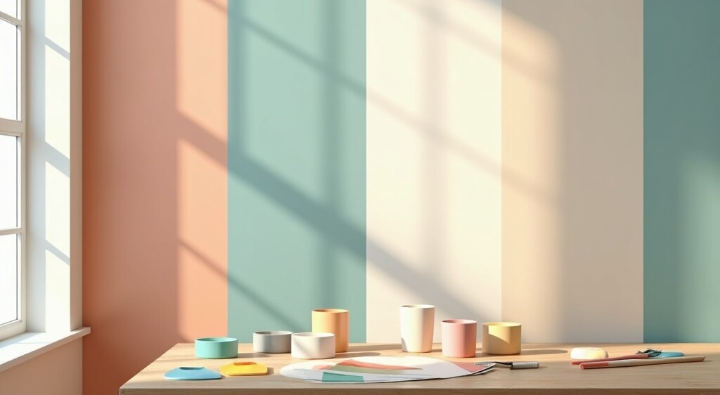
To make things a little easier, I like dividing colours into four groups: Deep, Midtone, Light, and Bright. These categories aren’t hard science, but grouping them this way helps you quickly figure out which shade family will probably mesh well with each space in your home. It’s all about using the right vibe in the right context. Small dark rooms crave a different mood compared to sunny open spaces or busy hallways. Over time, you’ll get a feel for what works by checking out photos, home tours, and real-world examples.
If you’re choosing paint samples, Houzz has a really useful article that’s worth checking out.
Deep Paint Colours: When to Go Bold, Best Rooms & Farrow & Ball Shades
Deep colours are often overlooked because they can feel a little intimidating, but they’re actually brilliant for creating depth, sophistication and a real sense of cosiness. Smaller or often-neglected spaces, like a snug, bathroom or even a windowless hallway, can really come alive with a rich, well-chosen tone. I’ve included links below to some of my favourite bold Farrow & Ball shades if you’d like a little inspiration.
Richly Pigmented Options
- Think Farrow & Ball’s Picture Gallery Red, Brinjal, Hague Blue & Studio Green. This brand is known for it’s depth and complex shades.
Where They Shine
- I love using deep hues on woodwork, wall panelling, accent walls behind shelves, or even for a glossy dark floor that grounds a space.
Finishes Matter
- Stick to matte (for a velvety look) or high-gloss (for drama). Satin can make deep tones look cheap or unfinished.
Pairing with Ceilings
- Avoid the classic stark white for ceilings. Instead, go with a neutral partner shade or a slightly tinted white that ties into your dominant wall colour.
Using deep colours takes guts, but the payoff is a room that feels special and a little surprising. If you’re on the fence, try adding a deep accent to a smaller, less visible area so you can see how it feels before committing to a full room.
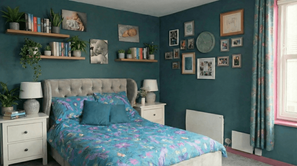
Our Bedroom decorated in Farrow & Ball; Coppice Blue (walls) and Rangwali (woodwork)
Midtone Paint Colours: Flexible Choices for Living Rooms, Bedrooms & More
Midtone colours are real crowd-pleasers; they work almost everywhere and rarely feel too cold or too sharp. They’re often the safest choice in rooms with tricky light, or where you want a space to feel relaxed but still interesting. Warm midtones, particularly those with yellow, curry or olive undertones, tend to perform especially well in overcast climates and typical British light, as they’re far less likely to turn drab. I’ve included links below to some of my favourite Farrow & Ball midtone shades if you’d like a bit of inspiration.
Midtone Paint Suggestions
- Farrow & Ball Babouche, Pink Ground or Setting Plaster.
Whole Room Wins
- Paint all four walls instead of just one; a single feature wall can sometimes chop up a room visually, while a full wrap of midtone colour brings the space together.
What Midtones are Great for
- Living rooms, bedrooms, entryways, or anywhere you want a soft, welcoming energy without going too light or too daring.
Pairing Tips
- These shades work really well with creamy whites on trim, or with deeper hues for a punchy accent.
Midtones are especially forgiving if you like to switch things up with decor or are prone to moving furniture around. They adapt easily as your style evolves or as family needs change.
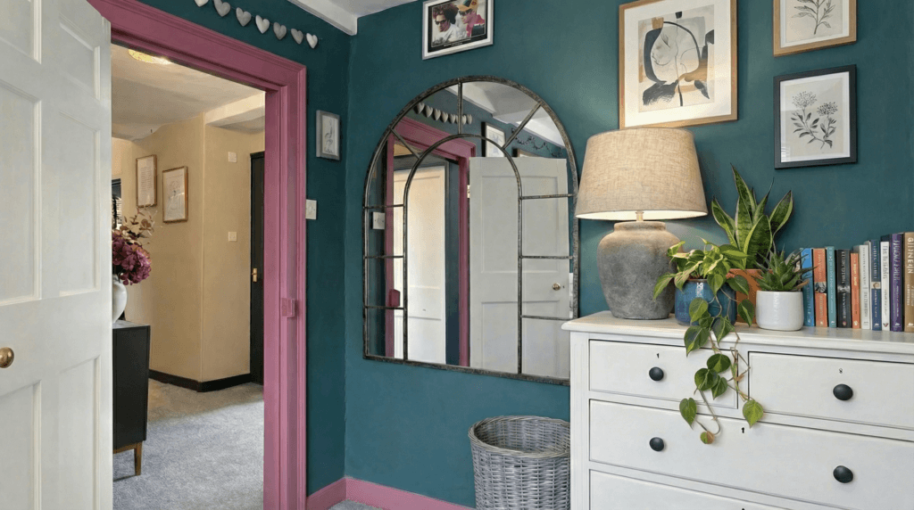
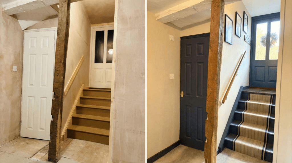
Entrance Hallway Makeover: A Calm Neutral Backdrop with Timeless Stiffkey Blue
This is the before and after of our newly remodelled entrance hallway. Last year, we finally took on the long-awaited renovation, and the transformation has been incredible! The “before” photo shows our hallway with plain plastered walls and a bare wooden staircase—just waiting for some personality and style.
I had always envisioned a classic stair runner paired with a rich blue staircase and front door. After years of planning, that vision became a reality! Once the staircase was painted, I decided the skirting boards needed to match for a cohesive finish. Since I had already used Farrow & Ball Stiffkey Blue in our kitchen (and absolutely loved it), it was the perfect choice for the hallway too.
For the walls, I wanted something soft and calming to balance the richness of the blue. After much deliberation, I settled on Farrow & Ball Dropcloth — a beautifully warm neutral that shifts gently with the light throughout the day. It creates the perfect backdrop, allowing the architectural details and deep blue accents to really shine without overwhelming the space.
The result is an entrance hallway that feels timeless, welcoming, and effortlessly elegant. It’s a space that now sets the tone for the rest of our home — calm, classic, and thoughtfully put together — and I couldn’t be happier with how it’s turned out.
Light Paint Colours: Classic Neutrals for Bright, Airy Spaces
Light tones are perfect for larger, sun-filled rooms or spaces where you want to create a calm, breezy atmosphere. It’s worth steering clear of harsh, pure whites, which can feel a little clinical or severe… particularly in period homes or older properties where the original features deserve a softer touch. I’ve included links below to some of my favourite light Farrow & Ball shades to help you find a gentle, flattering option.
Go-To Options
- Farrow & Ball Slipper Satin, White Tie & Dimity. These aren’t just “beige”; they add subtle depth and elegance.
Ceiling & Trim Tricks
- Instead of crisp white, try painting ceilings and skirting boards with a lighter tint of your wall colour. For example, if the wall is 60% colour, try 70% on the ceiling and 40% on the door or skirtings to build a soft layered effect.
Room By Room
- These shades bring out timeless charm, especially in period homes, but are just as lovely in new builds wanting a calming scheme.
Avoid In…
- Small, cold bathrooms—a super pale blue or green might look fresh in a magazine, but can end up looking a bit clinical or cold in real life.
Choosing a soft offwhite or a warm neutral is a safe move if your room gets lots of natural light or if you want a blank canvas for bolder furnishings or artwork. They make rooms feel more spacious and can set the backdrop for different design styles, from coastal to modern or traditional.
Bright Paint Colours: How to Add Accents Without Overwhelming a Room
Bright shades aren’t for covering an entire room unless you’re really committed to a certain energy, but they’re awesome for creating small, joyful moments throughout your home. I like to use these in small doses. Think of bright colours like adding a pinch of spice rather than making them the whole meal.
Recommended Colours
- Farrow & Ball Yeabridge Green, Bamboozle & Blazer.
Perfect Uses
- Bookshelves, inside cabinets, window frames, boot rooms, or hallways where you want a bit of a surprise.
Combo Tip
- In a long corridor, neutral walls keep things calm while bright doors, skirting, or trim wake up the space.
Less is More
- Use sparingly to avoid overwhelming the room. Bright shades best shine when used as highlights or details.
Bright colours can turn anything from a door to a bathroom shelf into something fun and memorable. A pop of colour can make a child’s room or a utility room lighthearted and eye-catching, without needing to repaint the entire room down the line.
Practical Tips Before Choosing and Applying Paint Colours
Paint choices only really come together when you consider room features, natural light, and what’s already inside the room. These pointers help you skip regret and get closer to a look you’ll genuinely enjoy living with.
How Lighting Changes the Way Paint Colours Look in a Room
- North-facing rooms tend to look cooler, so warm up your paint colour to avoid a chilly feel. South-facing rooms soak in more light, so both warm and cool shades can work depending on your mood.
Matching Paint with Floors, Furniture & Home Décor
- Factor in floor colour and big pieces. If you painted the walls before the sofa arrived, it might look completely different with that new blue velvet or brown leather in place. Pairing samples with your furniture upholstery or rugs can help you avoid clashing combinations later.
Why Paint Samples and Testers Are Essential Before Committing
- Always use paint testers on multiple walls, as colours change a lot depending on shadow and light. Watch how they perform at different times of day to get a real sense of their effect.
Choosing the Right Paint Finish (Matte, Eggshell, Gloss or Satin)
- Mattes hide little flaws and feel modern, eggshell is good for woodwork, and gloss on trim or even floors can look pretty snazzy if you’re feeling bold.
Quality over Quantity
- Once you’ve settled on a colour, picking a decent paint brand brings better coverage, depth, and an overall pro look. I think you have already guessed by now that I will always recommend Farrow & Ball!
Another practical tip: don’t rush! Sometimes living with swatches or tester patches for a week shows you how colours interact with changing light, weather, and even your mood throughout the day.
Creating Colour Flow Across Multiple Rooms
How Accent Colours Tie Different Rooms Together
Making rooms connect visually helps your home flow, even if you use lots of different shades. Sticking with similar undertones or using tints and shades of one colour can really pull things together. Carrying a single accent colour (like a blue or green) through doors, trims, or window frames across different spaces creates a sense of cohesion without everything matching perfectly.
Tips for Smooth Transitions Between Paint Palettes
When in doubt, walk from room to room and see how the transition feels. Adjust one or two surfaces (like skirting or doors) in a connecting tone to blend the move from one colour family to another. Picking out art, textiles, or even lampshades that echo paint colours from other rooms is another easy way to make the transition seamless.
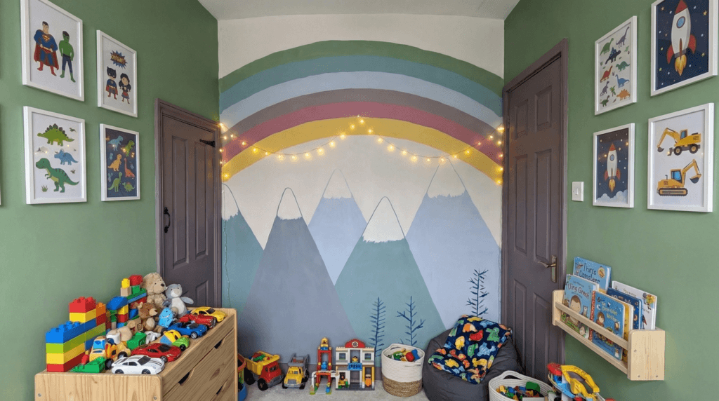
Playroom Makeover: A Rainbow Feature Wall with Farrow & Ball Chalke Green
When it came to redecorating our son’s playroom, the main colour choice was easy. I had already fallen in love with Farrow & Ball Calke Green in our bathroom and knew I wanted to use it elsewhere in our home. It’s such a versatile shade, and while the lighting made it look slightly different in the playroom, I loved it just as much here as I did in the bathroom.
My son was especially excited about the makeover and immediately requested a rainbow wall—his favourite colour! That set me off researching rainbow feature walls for playrooms. I came across plenty of inspiring designs, but the one that stood out most was a mountain scene with a rainbow arched above it.
I decided to give it a go, reminding myself that I could always paint over it if it was a complete disaster! Armed with brushes and a little bravery, I painted the scene freehand—no stencils, no special skills, just a bit of creativity.
To my surprise, I was really pleased with the results! The mountain and rainbow mural brought so much character to the space, and more importantly, my son absolutely loved it. Seeing his excitement made every brushstroke worthwhile.
FAQs: Choosing the Right Paint Colour for Your Home
Some questions come up again and again, so I’ve rounded up answers to the stuff I get asked most often:
What Are the Best Paint Colours to Make Small Rooms Look Bigger?
Use mid to light colours and stick with matte finishes. Painting trim and walls in the same shade can reduce visual clutter and make the space feel more open. Also, using mirrors or glass furniture helps bounce light and further creates the illusion of more space.
Should You Paint Ceilings the Same Colour as Walls?
Using a lighter version or tint of your wall colour on the ceiling softens edges and makes rooms feel finished. Plain, stark white only works in certain modern spaces, and even there, adding a hint of warmth can help make it feel less severe.
Which Paint Colours Stay Timeless and Don’t Go Out of Style?
Earthy midtones and warm neutrals tend to stay classic. Testing samples and living with them for a while helps make a confident choice. Also, avoid the trendiest colours unless you love them—your own style and comfort matter more than fleeting fads.
Is There a Rule for Choosing Wall Paint Colours?
There isn’t a single rule; it’s really about picking colours that work with your home’s light, existing features, and personal style. Use light colours to open up a space, deep shades for cosy drama, and always test samples first for best results.
How Do You Choose a Paint Colour Palette for Multiple Rooms?
I find a base palette with three or four colours (neutrals included), then mix up their placement and intensity in each room. Carrying one colour through trims or doors helps tie everything together. Make sure undertones are compatible for a more connected vibe across spaces.
What Paint Colours Are Replacing Grey in Modern Interiors?
Warmer neutrals like beiges, taupes, soft greens, and clay tones are now edging out grey. They bring warmth and flexibility to interiors while pairing well with most décor styles.
How Do You Decide What Colour to Paint a Room? (Step-by-Step)
Start by thinking about the room’s purpose, light sources, size, and what décor you already have. Test a few options and go with the one that makes you happiest when you walk in. Trust your own instincts; they’re usually right.
Final Thoughts: My Personal Approach to Choosing the Right Paint Colours
Over the years, I’ve learned that choosing the right paint colour isn’t just about following trends or sticking to rules—it’s a blend of instinct, observation, and a bit of courage. In the early days of my decorating journey, I played it safe with soft greys and neutral tones, unsure of how to make bolder choices. But as I grew more confident, I began to trust my eye and embrace the process.
Lighting, natural features, and existing furniture all play a big part in how a colour works in a space. Now, I use those elements as a guide—and most importantly, I trust my gut. A quality paint (Farrow & Ball is always my first choice) and some thoughtful planning can make a huge difference. Even small touches—like changing the finish or painting the ceiling—can completely transform the mood of a room.
What I’ve come to realise is that it’s just paint. If something doesn’t turn out quite how you imagined, it’s easily changed. So don’t be afraid to experiment and try something new. Decorating should be enjoyable, personal, and a true reflection of your style.
Author Bio: Bold Interior Design & Decorating Ideas
My love for decorating and interior styling began over 12 years ago when we moved into our Georgian home. At the time, the walls were plain, beige, and uninspiring—but I knew I wanted to add colour, personality, and warmth to our living spaces.
I started with soft greys and lighter tones, but it didn’t take long for me to become braver with my choices. Soon, I was experimenting with bold feature walls to add vibrancy and contrast. Today, I absolutely love using deep, dramatic colours in every room, creating interiors that feel both stylish and full of character.
As my home decorating journey continued, I realised how important it was to research and plan carefully to create timeless spaces. A few years ago, Farrow & Ball was recommended to me, and their paint colours and wallpapers have been my go-to inspiration ever since. Their expert guidance and colour palettes have helped me transform our home while staying true to its historic charm.
Beyond paint and wallpaper, I developed a passion for choosing the right home accessories and lighting to elevate each space. With a Georgian property, I wanted to highlight original features rather than cover them, so every decision was made to enhance the natural character of our home.
Through years of trial, research, and inspiration from online resources, I’ve learned how to blend modern interior design with traditional architecture. That’s why I created Garden Nest Living—to share tips, decorating ideas, and styling advice so others can create homes that truly reflect their personality while embracing bold, beautiful design.
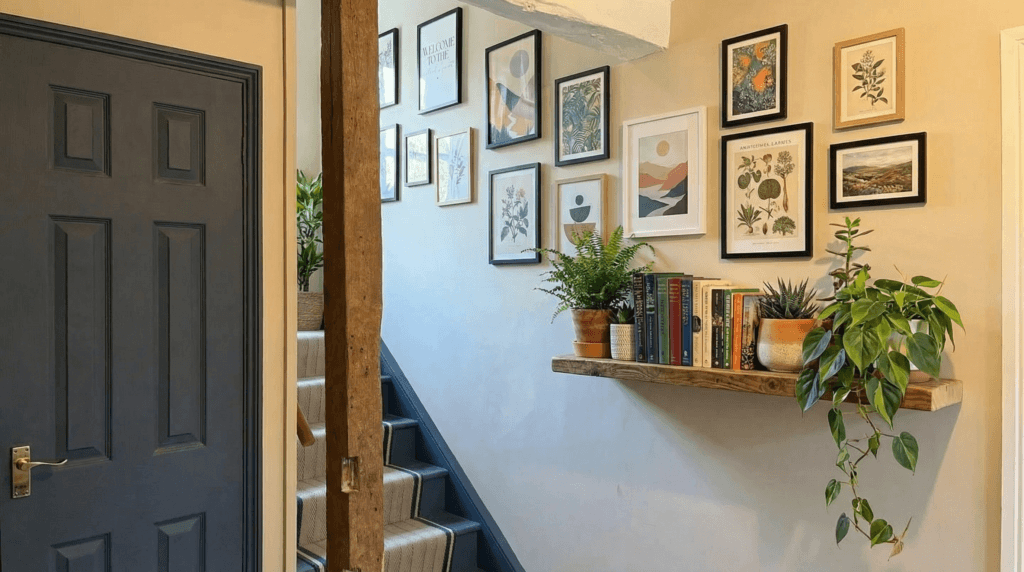
Our entrance hallway decorated in Farrow & Ball Stiffkey Blue & Dropcloth.
Hey a great post you have here!
I really enjoyed reading your post, it was very insightful especially since I am planning on painting and redecorating the rooms. I like how you have mentioned the points to think about as well as I hadn’t thought about them before. They should be considered when decorating a room as they certainly make a big difference.
Thanks again and have a great day!
Thank you so much for your kind words! I’m really glad to hear that you found the post helpful, especially as you’re planning to redecorate — that’s such an exciting project! It’s great to know the tips gave you a fresh perspective on things to consider. Wishing you all the best with your painting and decorating — I’m sure your rooms will turn out beautifully! Feel free to reach out if you ever need more ideas or inspiration.
The tip about testing paint samples at different times of day is so practical—it’s amazing how much natural light changes a color’s mood. I’d never considered how ceiling height affects color perception until you mentioned it; that makes total sense now that certain shades can visually “lift” low ceilings better than others.
The emotional impact breakdown (calm blues for bedrooms vs. energizing yellows for kitchens) feels especially useful. Do you find these psychological effects hold true across different cultures, or are there regional preferences that buck the trends?
Thank you so much! I’m really glad the tips resonated with you—light and ceiling height can make such a difference to how colours behave in a space.
Great question about colour psychology! While some emotional effects (like calming blues or energising yellows) are fairly universal, cultural and regional influences definitely shape how colours are perceived. For example, red can mean passion in one place and celebration or even warning in another. At the end of the day, I always encourage choosing colours that feel right for you and suit the mood you want in your home.
Thanks again for your thoughtful comment!
Struggling with the concept of putting paint on my walls for so long, they have been dark grey and white for years now. I was toying with the idea of green in the kitchen and had shied away from it. But then I saw the bit in your post with the Farrow & Ball green in the bathroom, and I absolutely love it. Thank you
I’m so happy to hear you feel inspired! I adore the Chalke Green shade—I even used it in our boys’ playroom recently, and it completely transformed the space. Best of luck with your redecorating!
Thanks for breaking down paint colours in such a straightforward way! I never thought of grouping shades into deep, midtone, light and bright categories – it makes choosing less overwhelming. I love your advice on using deep hues to make small spaces feel cosy and midtones to tie a living room or bedroom together, and your caution that pure white ceilings can feel stark if they don’t match the walls. I learnt the hard way that a cool grey looks icy in a north-facing bedroom, so testing samples in different light is genius. Your tip to carry accent colours through trim or doors to connect rooms is something I’ll be trying next time. Do you have a favourite bright colour for small pops, or a go-to neutral now that grey is on the way out? And how do you decide when to commit to painting a whole room versus just doing an accent wall? Thanks for the inspiration and for reminding us it’s just paint – we can always change it!
I’m so glad you found the breakdown helpful! Testing colours in different light really does save a lot of surprises later—I’ve had my fair share of “why does this suddenly look blue?” moments too. My favourites are dark blues, although at the moment I’m leaning towards deep, rich greens – they have such a grounding, timeless feel while still adding personality.
For small pops of bright colour, I love mustard yellow or coral—they play so well against neutrals without overwhelming a space. And speaking of neutrals, warm taupes and soft beiges are my current go-tos now that greys are taking a step back; they add warmth while still feeling modern.
When it comes to accent wall vs. whole room, I usually let the room itself guide the decision. If it’s a smaller space that could benefit from feeling cocoon-like, I’ll go all in. But in larger or more open areas, a single accent wall can add interest without overpowering the flow.